Oh Cathay Pacific, you treat us so well!
In this post:
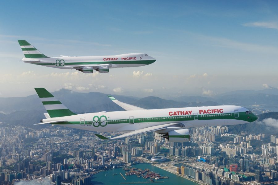
Cathay Pacific marks 80th anniversary with nostalgic livery
Hong Kong’s own Cathay Pacific is marking its 80th anniversary. While the airline is promising various initiatives for this celebration, there’s one that aviation enthusiasts will particularly look forward to.
Specifically, the oneworld airline will introduce two aircraft in its signature “lettuce leaf sandwich” livery:
– The Airbus A350-900 with the registration B-LRJ has commenced service as of January 6, 2026
– A Cathay Pacific Cargo Boeing 747-8 is anticipated to start service as of January 24, 2026
Cathay Pacific is committed to unveiling one more special livery, although specifics on which livery it will be, and on what aircraft, are still forthcoming. I can’t wait to catch sight of these planes from the Hong Kong Airport (HKG) Sky Bridge. For that matter, I’m sure I’ll spot the special 747-8 in Miami, considering Cathay Pacific Cargo frequently arrives at my home airport.
Bring on the “lettuce leaf sandwich!”
Cathay Pacific’s livery transformation through the years
For some insight into Cathay Pacific’s liveries, the airline commenced its operations in 1946, with a modified Douglas DC-3, affectionately named “Betsy” (a term still used by the airline). Initially, the aircraft carried cargo between Australia and China, though the founders had grander visions. They named the airline Cathay Pacific Airways, due to their belief that planes would one day traverse the vast Pacific ocean.
The livery back then was quite simple, featuring a bare-metal body with “Cathay Pacific Airways” inscribed in red cursive on the fuselage.
Cathay Pacific’s first livery
In the 1960s, Cathay Pacific entered the “jet age,” introducing a fleet of Convair 880s adorned in a green-and-white livery. The airline name displayed on the fuselage was abbreviated to “Cathay Pacific” in red, uppercase lettering.
Cathay Pacific’s second livery
From the 1970s to the early 1990s, Cathay Pacific adopted what became known as the “lettuce leaf sandwich” livery, utilized on the fleet of Lockheed L-1011 TriStars and Boeing 747s. The tailfin featured alternating stripes of white and Brunswick green, reminiscent of a pile of salad leaves.
Cathay Pacific’s third livery
Then beginning in the 1990s, as Cathay Pacific’s route network spread across Europe and North America, the airline sought a fresh look centered on its identity as Hong Kong’s flagship carrier. In 1994, the airline introduced the brushwing logo, a flight symbol depicted in a graceful calligraphic style, honoring its Chinese roots. The airline also replaced Brunswick green with the sophisticated Cathay jade.
Cathay Pacific’s fourth livery
In 2015, Cathay Pacific unveiled a sleeker rendition of this livery, eliminating the red stripes from the tailfin and nose, alongside other revisions.
Cathay Pacific’s fifth (and present) livery
The “lettuce leaf sandwich” livery is arguably Cathay Pacific’s most distinguished design, and I can hardly wait to see one of these planes up close.
That said, the “lettuce leaf sandwich” livery predates my travels to Asia, and my fondest experiences with Cathay Pacific are tied to the livery just before the current one. Thus, I’m hoping the third aircraft with a special livery will feature that design (though I suspect it may be the one preceding the “lettuce leaf sandwich” livery).
Bottom line
Cathay Pacific is celebrating its 80th anniversary by painting two aircraft in its “lettuce leaf sandwich” livery, which was the airline’s standard design for roughly two decades, from the 1970s to the 1990s. This was truly when Cathay Pacific emerged as a global contender, making it thrilling to witness the livery’s return.
If you’re an aviation enthusiast, keep an eye out for an A350 in this special livery. In the upcoming weeks, we also expect to see a cargo 747 in the special livery.
Is there anyone else who loves the “lettuce leaf sandwich” livery as much as I do?