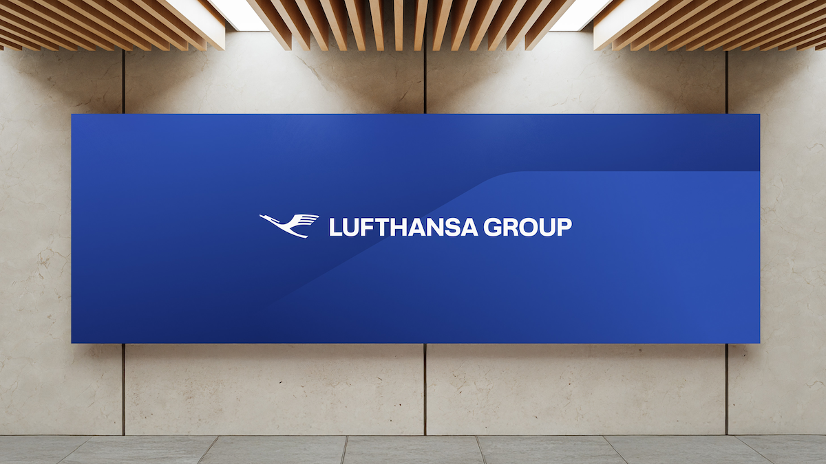
Lufthansa Group has recently introduced a fresh brand identity as part of its approach to centralize the management of its distinct airline brands and foster closer ties among them. The updated identity showcases a revamped version of the renowned crane logo, now represented without the circle, and rolls out a new font and color palette featuring six additional shades. These modifications are designed to embody the diversity of the Lufthansa Group and improve the visibility of its service offerings under a cohesive brand.
The airlines within the Lufthansa Group, including Lufthansa, SWISS, Austrian, Brussels, Discover, and Eurowings, will continue to have their unique brands while being recognized as “Members of Lufthansa Group.” This recognition will be displayed on all aircraft and various materials at airports and onboard, emphasizing the group’s unity.
By 2026, the new brand identity will be evident at lounge entrances globally, further integrating the Lufthansa Group’s visual presence. The revamped branding is considered a strategic milestone that enhances customer trust and delivers a comprehensive brand experience.
In summary, the rebranding is viewed as a considerate step to connect all Lufthansa Group airlines more intimately, with a warmer and more varied color palette replacing the former sterile combination of dark blue and gray. The adjustments are anticipated to bolster the group’s visual identity and brand recognition across its international operations.